iOS Screen-Time Apps for Creatives (2026)
If you do any sort of creative things for a living, a screen-time app has one job: protect the place where the work happens, without nagging you like a productivity coach. Over the last few years I have tried a bunch of them and I genuinely liked a few, which I want to talk about. However, all of them missed something for me, so I built Nowhere and it has a different approach which I hope might resonate with you too.
What creatives need that other people don't
A screen-time app for a creative isn't the same as one for others. Here is why.
The flow is expensive to rebuild. A distraction mid-sentence or mid-sketch doesn't cost you the thirty seconds you spent on it. It costs the ten minutes it takes to get back into the flow. Minimum. Thus any app’s job is to protect that state.
Input poisons output. Two hours of scrolling doesn't just steal time, it floods the well you draw from. You start making things that look like something you already saw. By design, we are all living in a postmodern world where everything has already been made. But it takes time for the brain to collect these visuals and turn them into something new. Just copying makes the work mean less.
Taste is a real requirement. You'll keep a tool on your phone if you don't hate looking at it, and uninstall a good one that's ugly. For most people that's vanity. For you it's just honesty about how you work.
Most gamification grates. Streaks, points, pets, "you crushed it" — a lot of makers bristle at the productivity-bro register. Worth knowing which apps lean into it and which avoid it.
You might have another list, but from what I learned, these four are the most common.
The apps
Freedom — the serious wall.

What it does: Blocks apps and whole sites across your Mac and phone at once, with a Locked Mode you can't easily wriggle out of and ambient sound for deep work. It markets itself explicitly against streaks and points — pure focus, no game. Not beautiful; it's a utility, and it acts like one.
Best for: writers and designers who work across devices and want a hard wall around a session.
What I missed: a bit utilitarian to look at. It’s well crafted and it looks professional but lacks some personality, design, concept.
one sec — the pause.
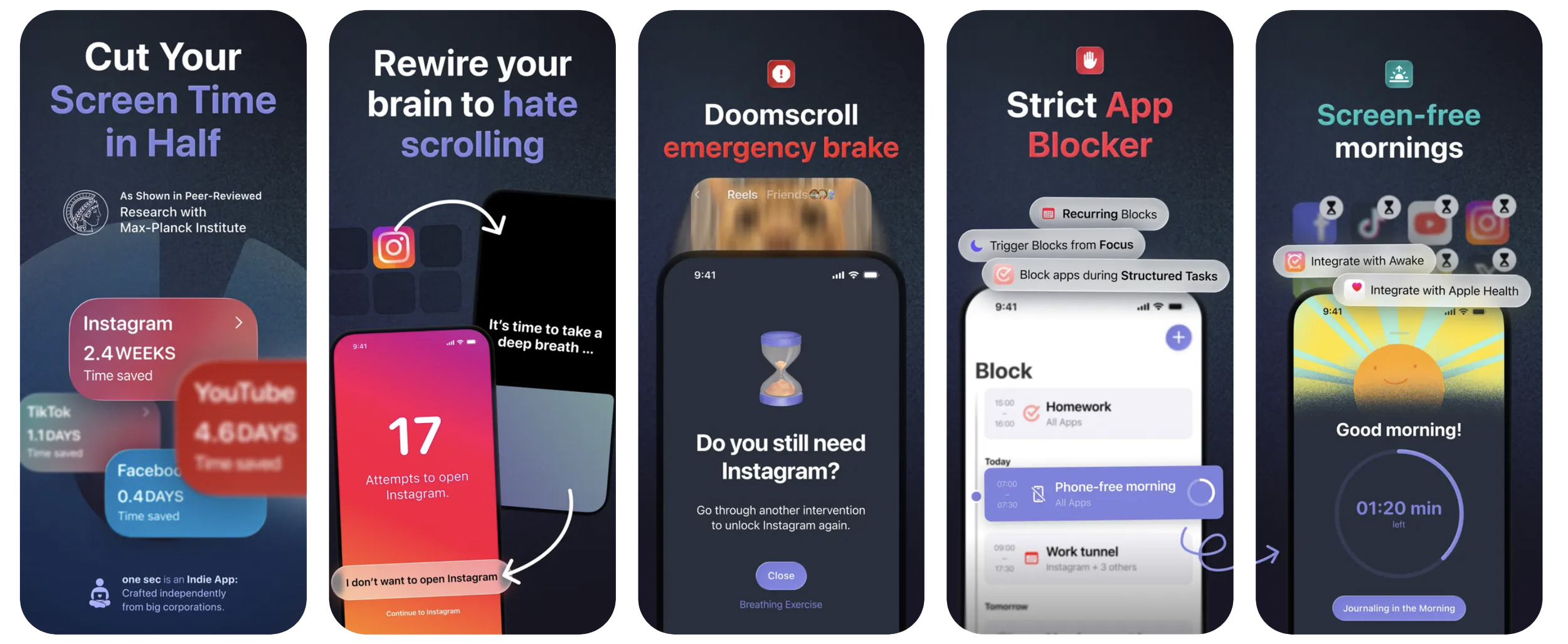
What it does: Instead of blocking, it puts a breath between you and the app — open Instagram, get a short interruption first. It's enough to break the reflex of opening something on autopilot while your hands wait for a render.
Best for: people whose problem is the muscle memory, not the intention.
What I missed: it's a nudge, not a fence — on a bad day you'll push straight through. Also I found it pretty hard to set up, because the team uses the Apple Shortcuts mechanism (which is also find kind of genius and respect that purely).
Opal — the polished one.
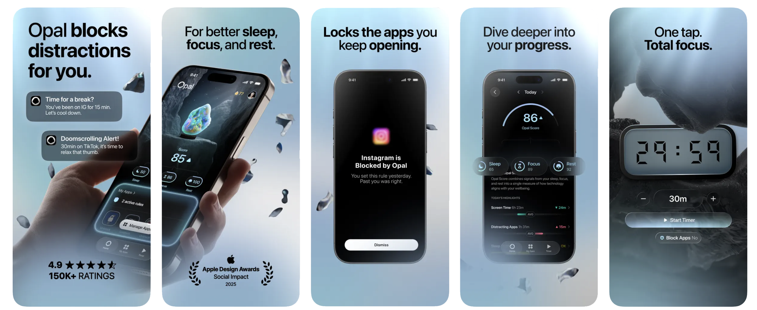
What it does: Genuinely lovely UI, focus sessions, schedules, a Focus Score that tracks how your day went. The kind of premium tool creatives tend to like holding.
Best for: makers who want something beautiful and a little data-driven.
What I missed: it leans scoreboard. If "score" and stats are exactly the framing you came here to escape, that'll wear on you.
Jomo — the design-conscious one.
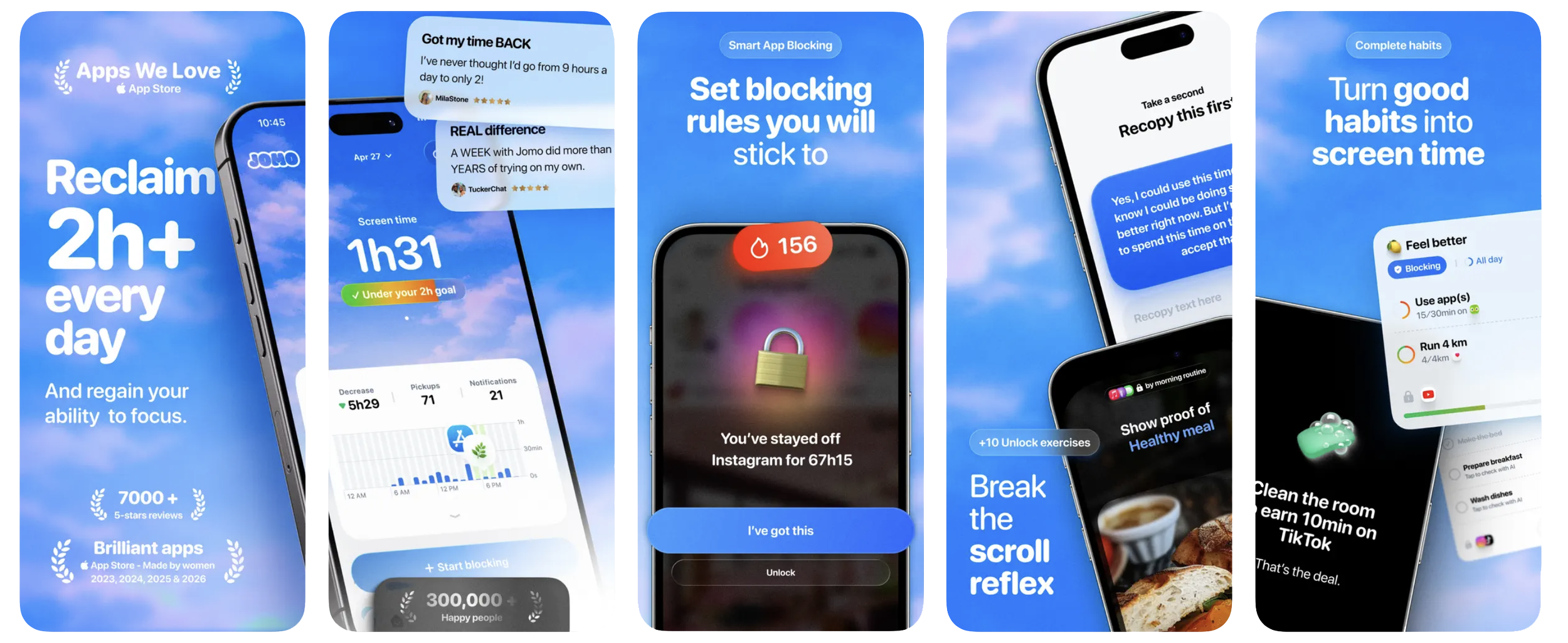
What it does: "Your phone, your rules" — flexible schedules, limits, strict mode, even journaling, wrapped in a minimal, editorial, Apple-first aesthetic.
Best for: design-minded power users who want to tune every rule.
What I missed: all that flexibility is setup; it rewards fiddling.
Forest — the gentle one.
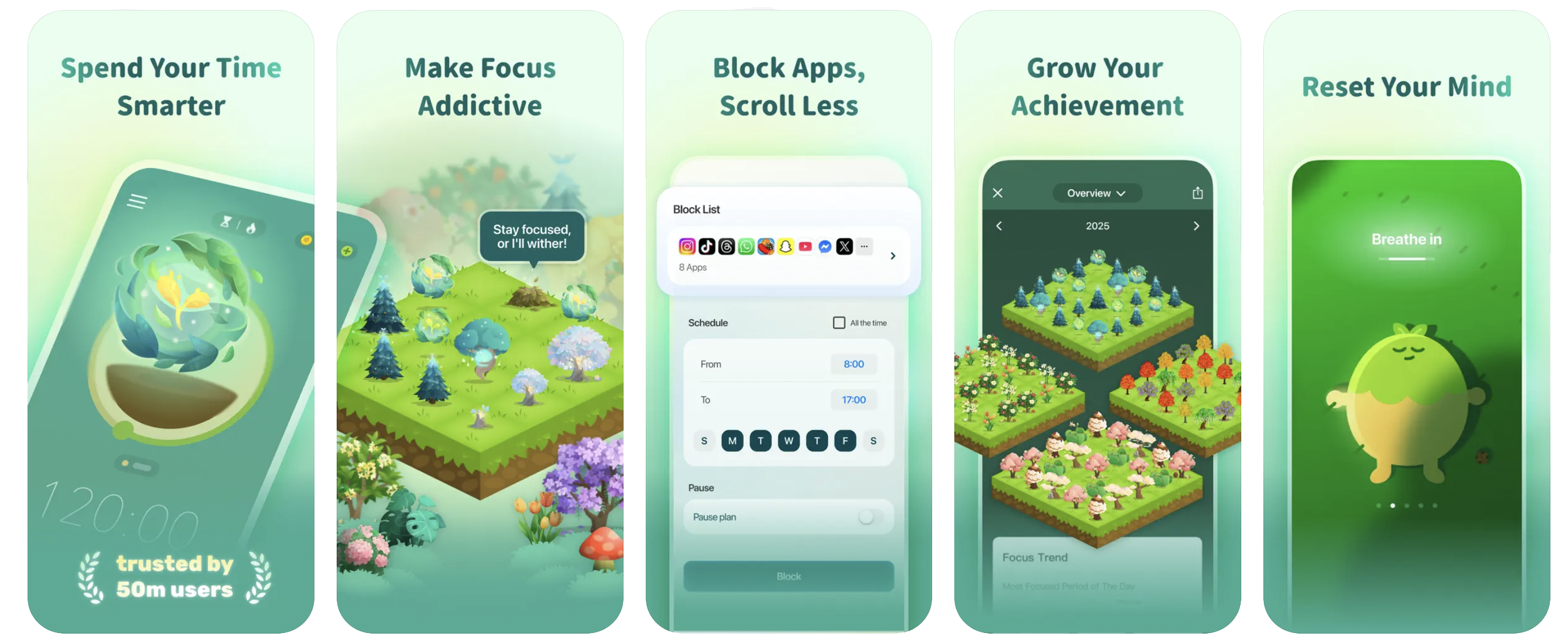
Plant a tree at the start of a focus session; leave early and it dies. Soft stakes, a cute visual, real trees planted through a partner.
Best for: people who want a playful nudge, not a lecture.
Caveat: it is gamification. If pets and streaks are the thing you're allergic to, this isn't your app — and that's fine.
Nowhere — the one I needed.
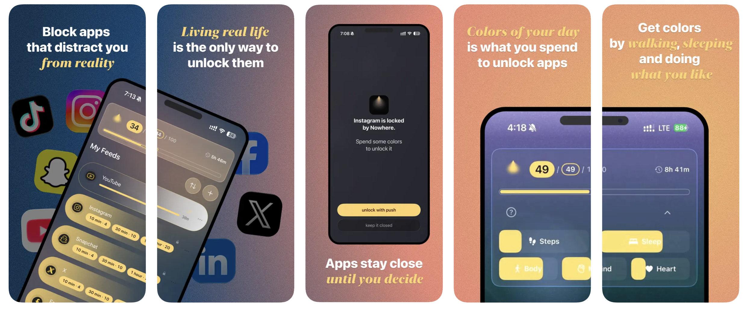
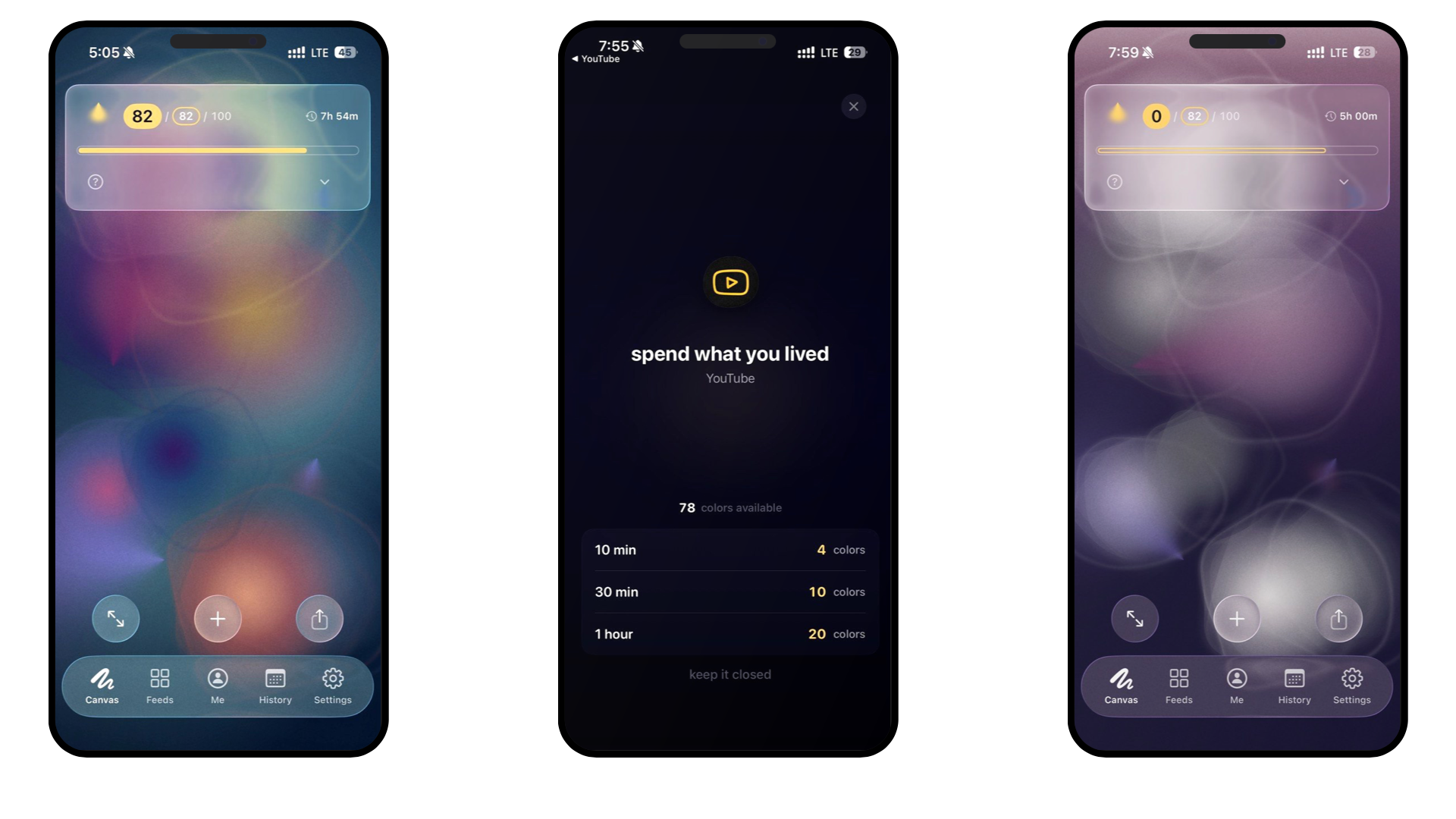
What it does: Your real life — steps, sleep, a few small daily choices — makes color. You spend that color to open the feeds you've closed. And the day builds into a generative canvas you can actually look at; opening a feed visibly drains it. No score, no streak, no points — the opposite of a scoreboard. I built it because every other option treated my day as a number to shrink, and I wanted to see it instead.
Best for: the creative who wants the tool itself to feel like a made object, and who'd rather watch a picture than read a stat. Has widgets, can even set your canvas on the iPhone wallpaper.
What I missed: nothing, but of course I’m biased.
Which one's for you
- Want a hard wall across Mac and phone for a work session — Freedom.
- You keep opening Instagram on autopilot, hands idle — one sec.
- You like a beautiful tool and don't mind a little data — Opal.
- You want to fine-tune every rule, design-forward — Jomo.
- You want a soft, playful push, not enforcement — Forest.
- You want the tool to embrace the reality without turning your day into a guilt — Nowhere.
The honest truth about all of these: the best screen-time app is the one you'll actually leave switched on. For a lot of creatives that comes down to taste as much as features — which is exactly why the category is worth being picky about.